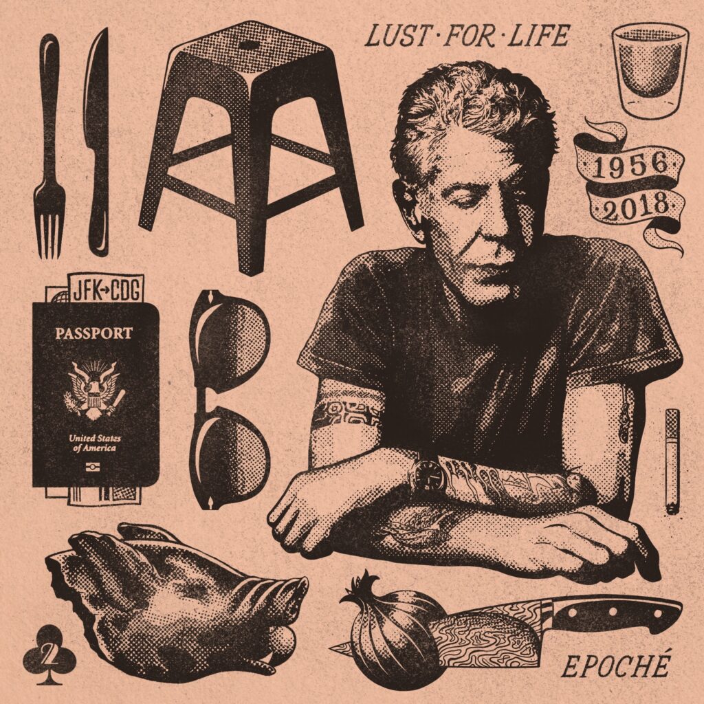
When I found out about Anthony Bourdain’s death, it hit me in a way most celebrity deaths do not remotely approach. I always admired his love of travel and appreciation for cultures & foods the world over. He was someone who could sit on the curb eating street cart food and treat it with the same reverence as five star dining. Dude was exceedingly cool, and I was lucky enough to run into him on the street in the Lower East Side a few weeks prior to his death. So when I found out, I drew this flash sheet style piece with little references to things I enjoyed from his TV career.
Since being posted on my Instagram, it’s been used as ads for random cooking accounts, and sold as prints and shirts on random people’s Etsy stores. It has really had its own life outside my control since I first posted it.
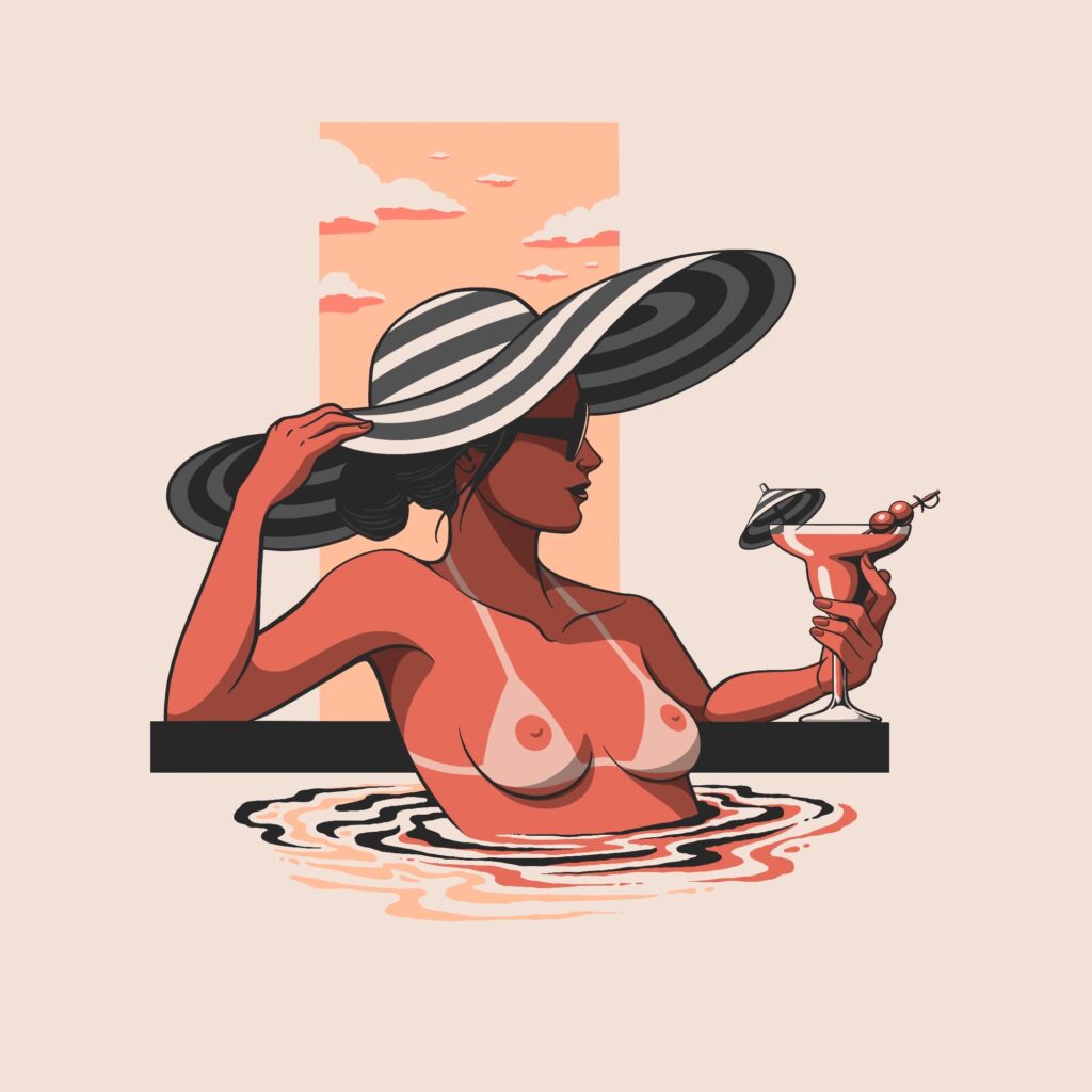
This piece was inspired by the kinds of lifestyle illustrations I’d see in vintage issues of Bazaar, The New Yorker, etc, with modern sensibilities like what I see in Malika Favre’s work. I wanted to keep this piece down to a few colors, and keep it fun but elegant. I made it a point to have her as sunburnt as her daquiri is red, to have the drink umbrella match her hat, to have the two cherries on the cocktail sword mirror her nipples, to have the water reflect and distort the stripes on her hat in a way that wasn’t too accurate. One of my favorites of the last few years.
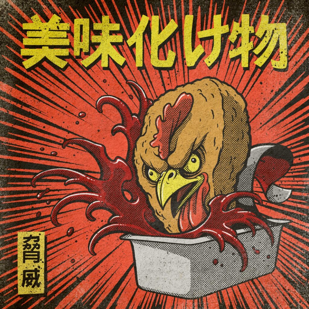
Sometimes you get inspired by watching monster movies while eating chicken nuggets, as is the case here. I referenced traditional Japanese prints and 60’s-70’s kaiju movie posters for this, which helped me give this monster nugget a dynamic feel. It also gave me an excuse to break out techniques like Japanese finger waves, which is something I love incorporating into a design where it normally wouldn’t be. Drawn in Procreate
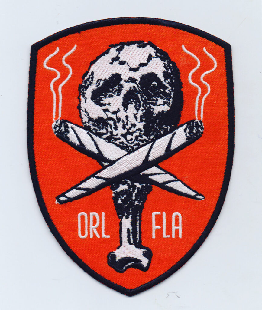
Commissioned patch design for Orlando based band, The Fatties. A skull and crossbones made of fried chicken and joints. Its an interesting balancing point to hit where you’re adding texture to a chicken drumstick, but not too much so that it comes across as noise, and just enough room to give those skull shadows an identifiable look. I think it turned out well. the symmetrical layout and minimal color gives it a very classic patch design style.
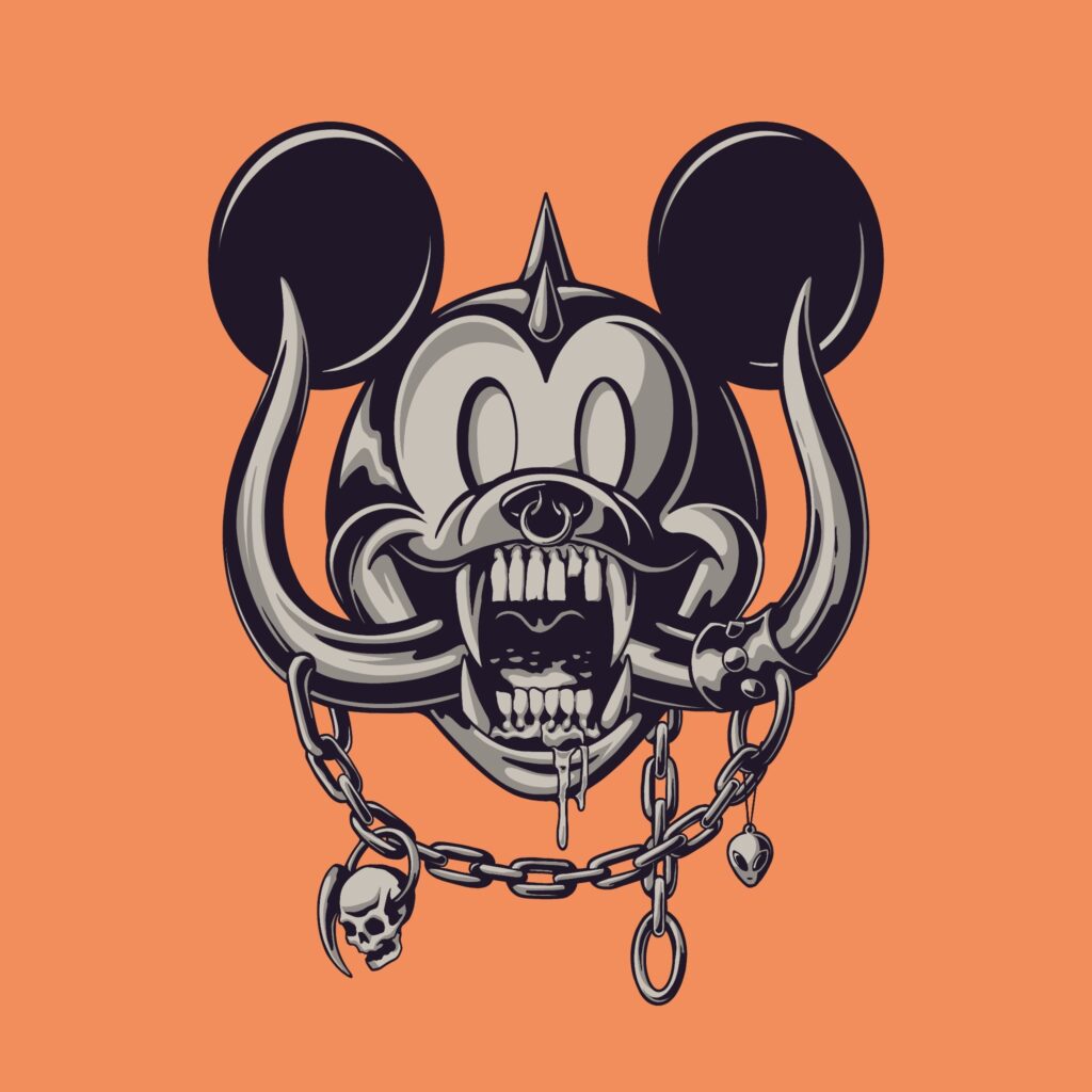
This Mickey-Motörhead mashup concept was irresistible to me, being a metal fan who grew up in Orlando with Disney employees in my family. the icons mesh so well together it feels like this is a version of the character that exists in a cooler parallel dimension. Once Mickey enters public domain in 2024, I’m going to print this on absolutely everything.
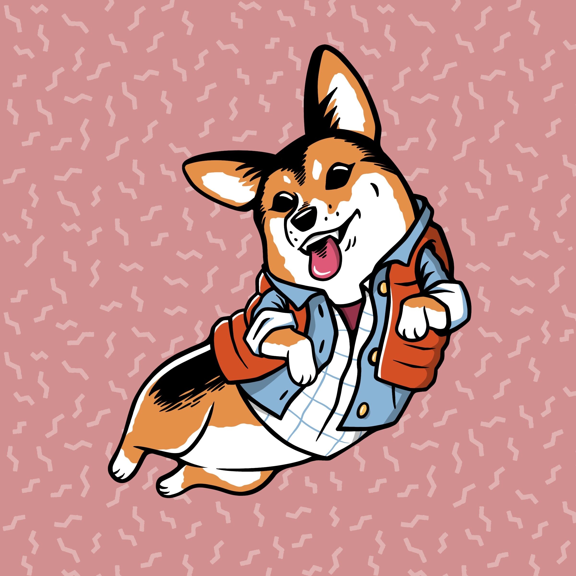

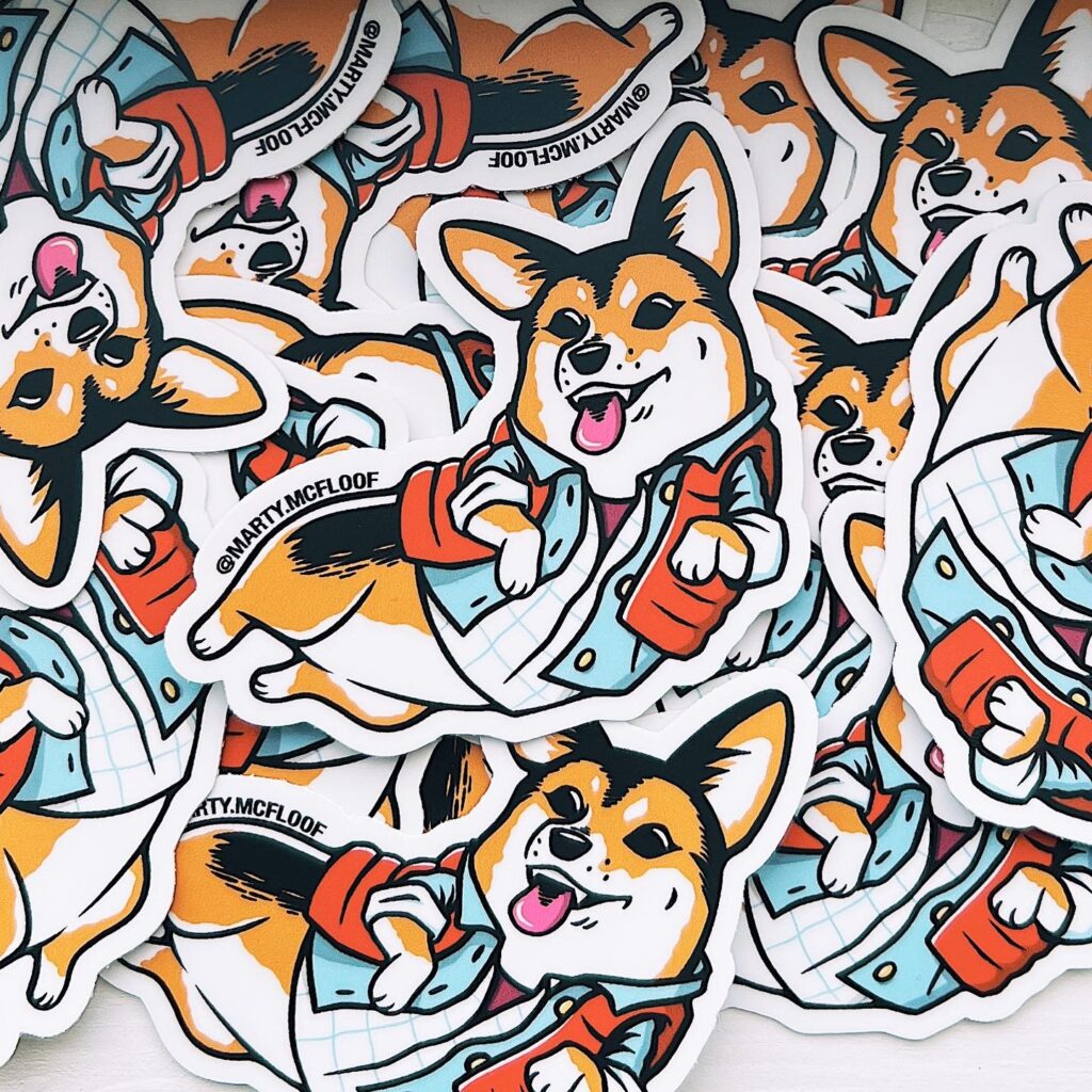
Commission for the adorable Marty McFloof (@marty.mcfloof on insta), which started as an illustration, turned sticker design and eventually, thigh tattoo on the owner, Zac. They’d requested a bit of Marty Mcfly’s outfit from Back to The Future, which is perfect fall weather clothing for a growing pup. Done in Procreate.
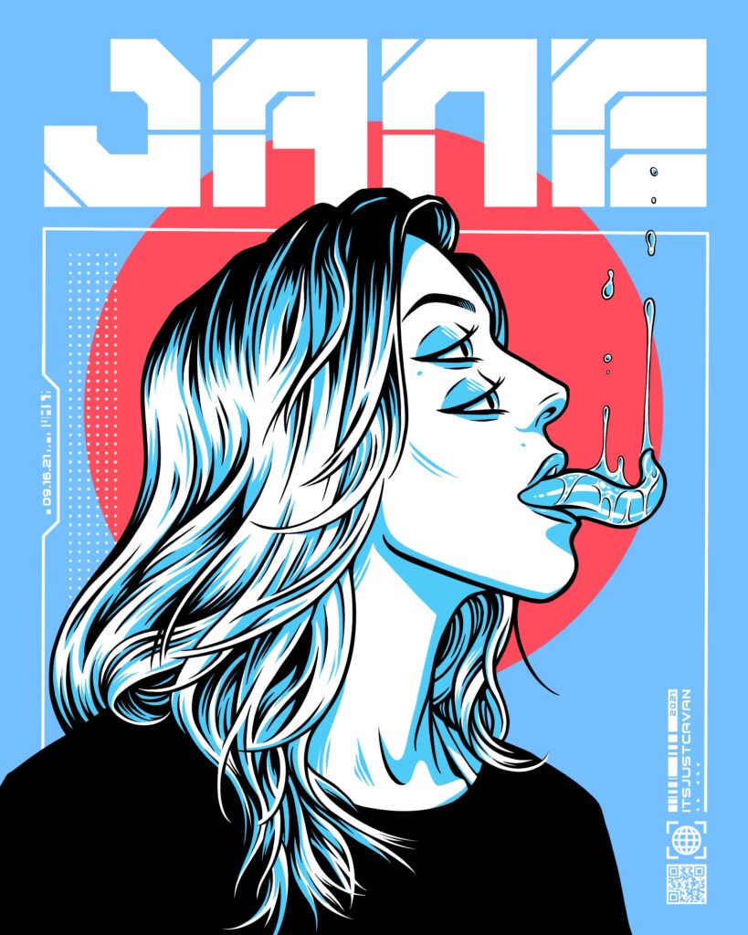
This started as practice for working on my hair drawing skills (based on a photo a friend sent me). It ended up getting a bit surreal when I doubled her eyes and started giving her this crazy tongue and anti-gravity drool. It was developing a bit of a sci-fi feel at that point, so adding the frame and text with this styling fit the tone. Drawn in Procreate.
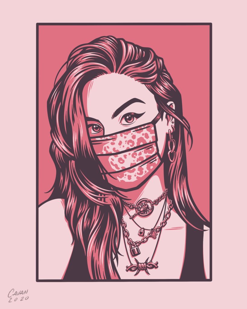
This portrait of my friend Katie is a good example of my work hitting that minimal color, silk screen aesthetic. It’s also one of my favorite drawings of hair that I’ve ever done. Done in Procreate.